Kissflow mobile explorations
Early mobile UI concepts for tasks, new requests, and account - conversation starters before deeper product definition.
Problem
Kissflow was built primarily for the web, and mobile hadn’t really been defined yet... things like how people would sign in, view their work, start requests, or manage their account. Without a shared set of visuals, those conversations stayed pretty abstract, with everyone picturing something slightly different.
Process
I put together a small set of high-fidelity mobile frames - not a full product spec, but a stimulus for workshops and critiques. The goal was to make tradeoffs visible: information hierarchy on small screens, where the primary action lives, and how the brand translates outside the desktop app.
Solution
Below are five screens in a plausible flow: sign-in, the task hub, browsing apps to start a request, a filled-out form example, and account settings. Each block pairs a short rationale with the matching frame.
Entry and trust
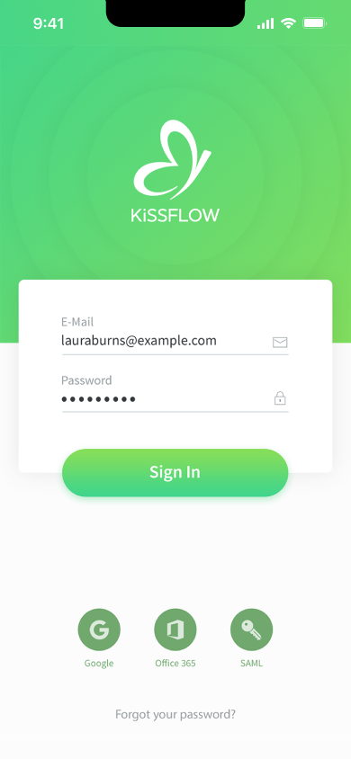
The login screen keeps brand presence upfront - gradient header, KiSSFLOW mark, and familiar email/password plus Google, Office 365, and SAML entry points so the conversation could include enterprise reality early.
Work in motion
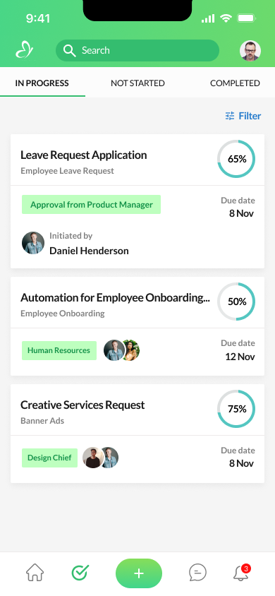
The tasks view explores how people might scan work on the go - In progress / Not started / Completed, progress rings, stage labels, due dates, and a consistent shell (search, profile, primary “+”, chat, alerts).
Discovering apps
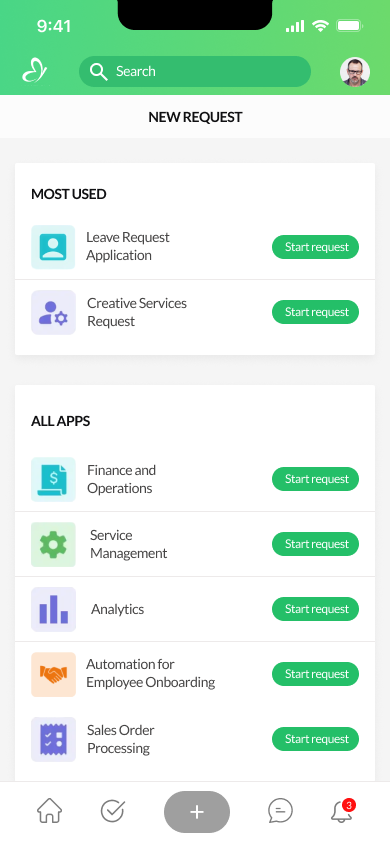
New request separates Most used from All apps so repeat workflows stay one tap away while the full catalog stays browsable - each row ends with a clear Start request action.
Filling a real request
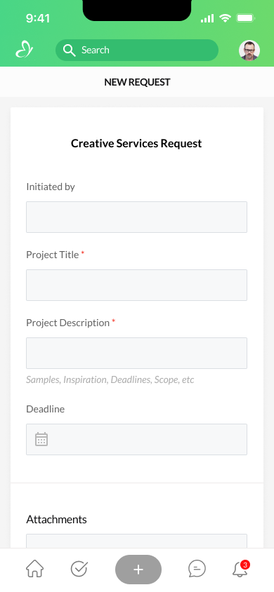
The Creative Services Request form shows how a specific app might feel - required fields, helper copy under description, a deadline control, and an Attachments section to ground the discussion in real submissions.
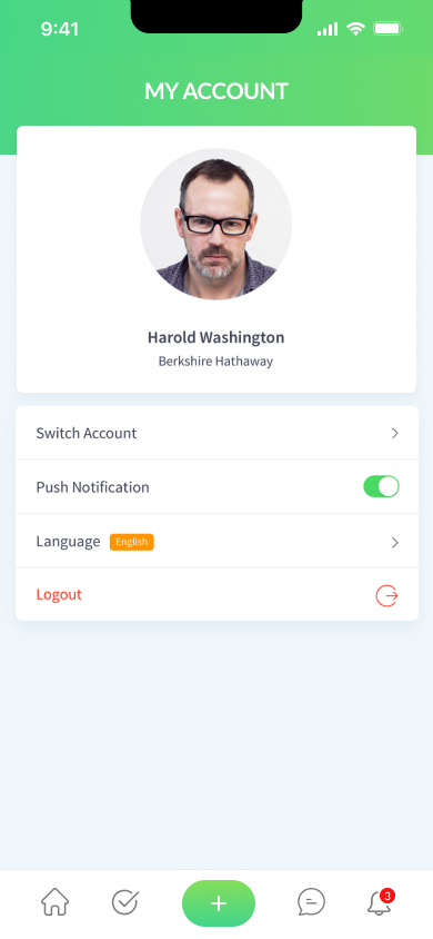
Account and preferences
My Account rounds out the loop - identity, switch account, push notifications, language, and logout - so mobile wasn’t only about workflows but also day-two needs.
These screens were deliberately early: enough fidelity to react to, light enough to revise. They helped the team align on navigation patterns, density, and what “mobile Kissflow” could mean before committing to build scope.
More work
Continue exploring case studies