Form builder for Kissflow 2.0
Giving users a faster, more flexible form building experience.
The form builder was central to Kissflow’s platform, supporting a wide range of business workflows across industries. Despite its flexibility, product analytics and support feedback revealed recurring friction during form creation.
We identified issues through:
- Google Analytics (drop-offs and time spent in form creation)
- User feedback collected by the support team
- Repeated feature requests and workarounds observed in usage patterns
Problem
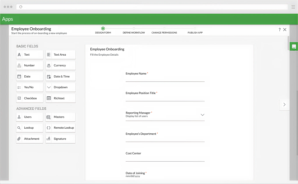
Kissflow helps teams automate internal work with low-code apps. The form designer was holding the product back; it looked dated, felt rigid, and made simple tasks like picking a field type, fixing the field order or explaining validation, harder than they should be.
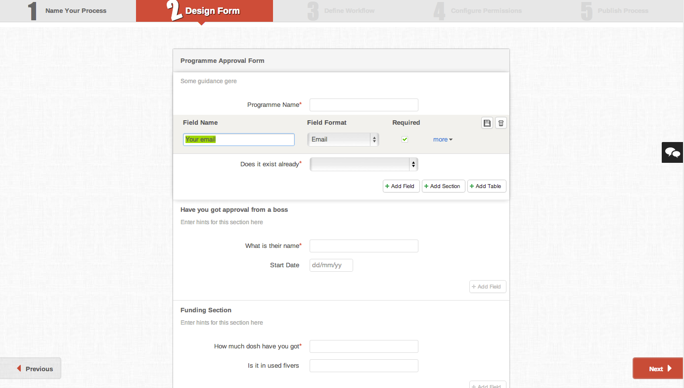
What we heard and saw
Inflexible field arrangement
Users could not easily rearrange fields once they were added.Impact: Editing became destructive and time-consuming, which slowed iteration and made form updates frustrating.
Limited field visibility
Users had difficulty discovering the right field types while building a form.Impact: This increased incorrect field usage and pushed users toward workarounds instead of intended workflows.
Misleading colour scheme
The interface used visual cues that resembled error states even in neutral or valid contexts.Impact: Users hesitated during form setup and had less confidence in the builder’s feedback.
Lack of rich text input
The builder did not support richer formatting options for longer or more structured content.Impact: This reduced flexibility for teams creating more detailed internal forms.
No signature addition
There was no native way to include signature capture within the form.Impact: Users had to depend on external steps or tools, breaking the continuity of the workflow.
Unclear input validation
Validation rules and messages were not always visible, descriptive, or easy to interpret.Impact: Users struggled to diagnose issues quickly, which increased friction during setup and testing.
Process
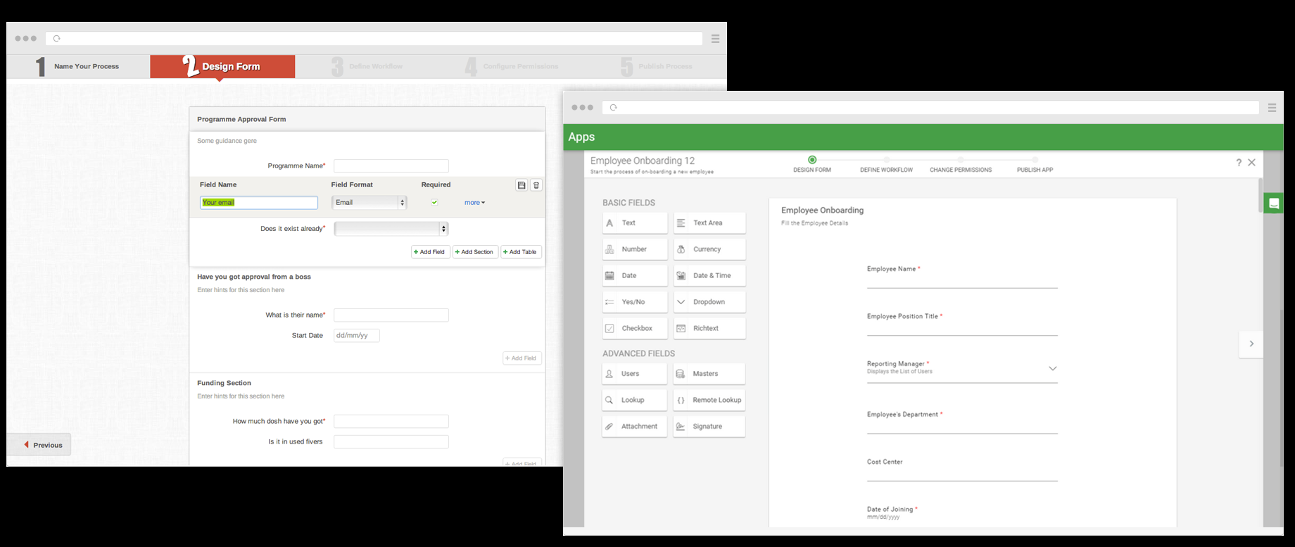
I worked as a product and UI designer alongside PM, design, and engineering - shipping 300+ high-fidelity screens for Kissflow 2.0. For the form designer we started from an audit of the legacy flows, then aligned on a direction that could scale across the rest of the app.
Material Design (2015) was the shared language: cards, spacing, motion, and predictable affordances users already understood from other tools. Quick prototypes helped the team agree before we invested in build-out.
Solution
Design principles
Support iterative editing
Form creation is rarely linear. The builder needed to support changes without forcing users to undo and rebuild work.
Improve discoverability
Field types and actions needed to be easier to find so users could move forward without relying on memory or trial and error.
Clarify system feedback
The interface had to communicate state more clearly, especially around validation and editable elements.
Balance speed with flexibility
The builder needed to work for both new users learning the flow and experienced users moving quickly through repetitive tasks.
Material structure
Cards, generous whitespace, and an on-brand palette replaced grey-on-grey tables. Primary actions read as intentional, not alarming.
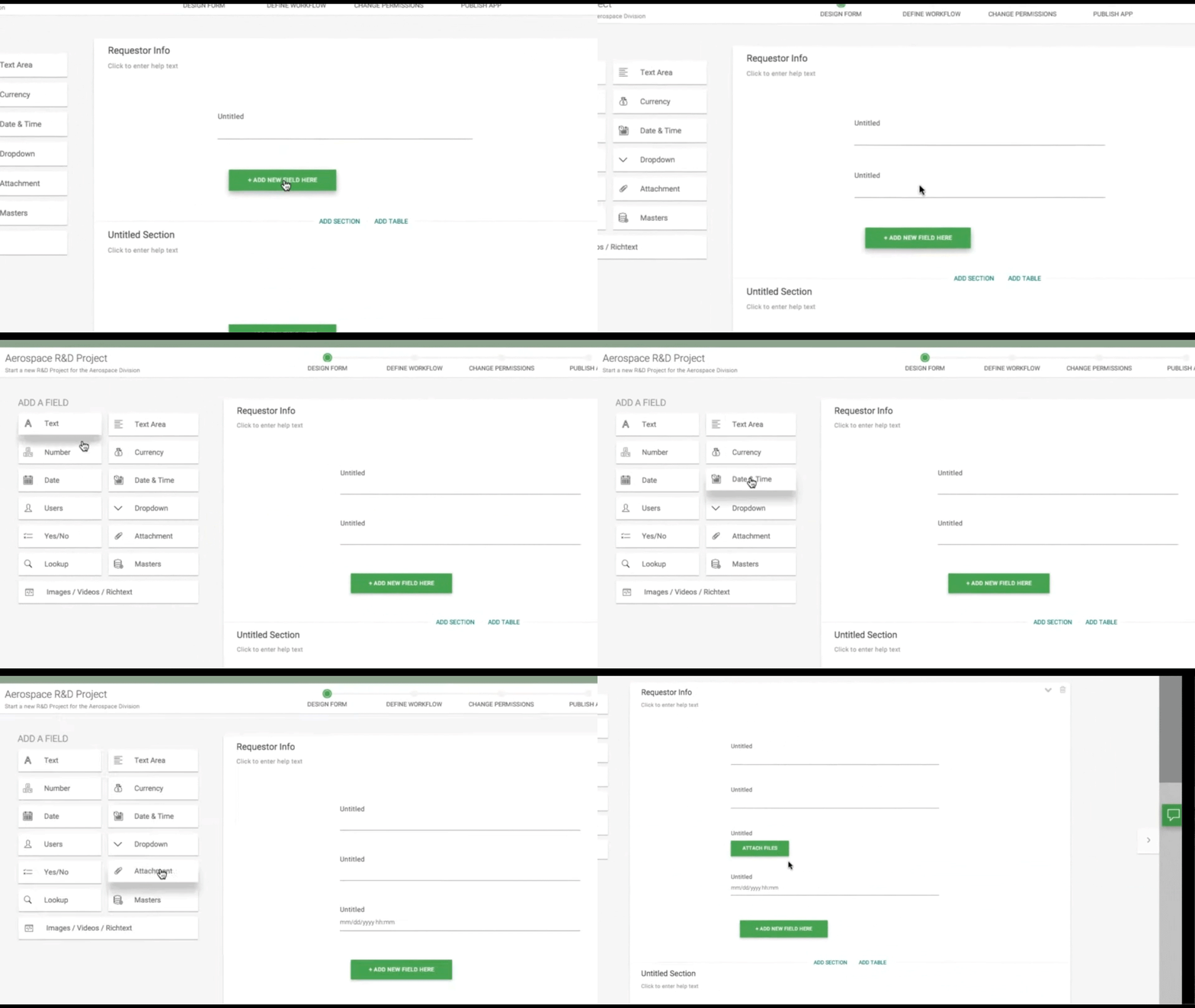
Three ways to add a field
"Add new field here" on the canvas, choose a field type from the left list, or drag from the list into place.
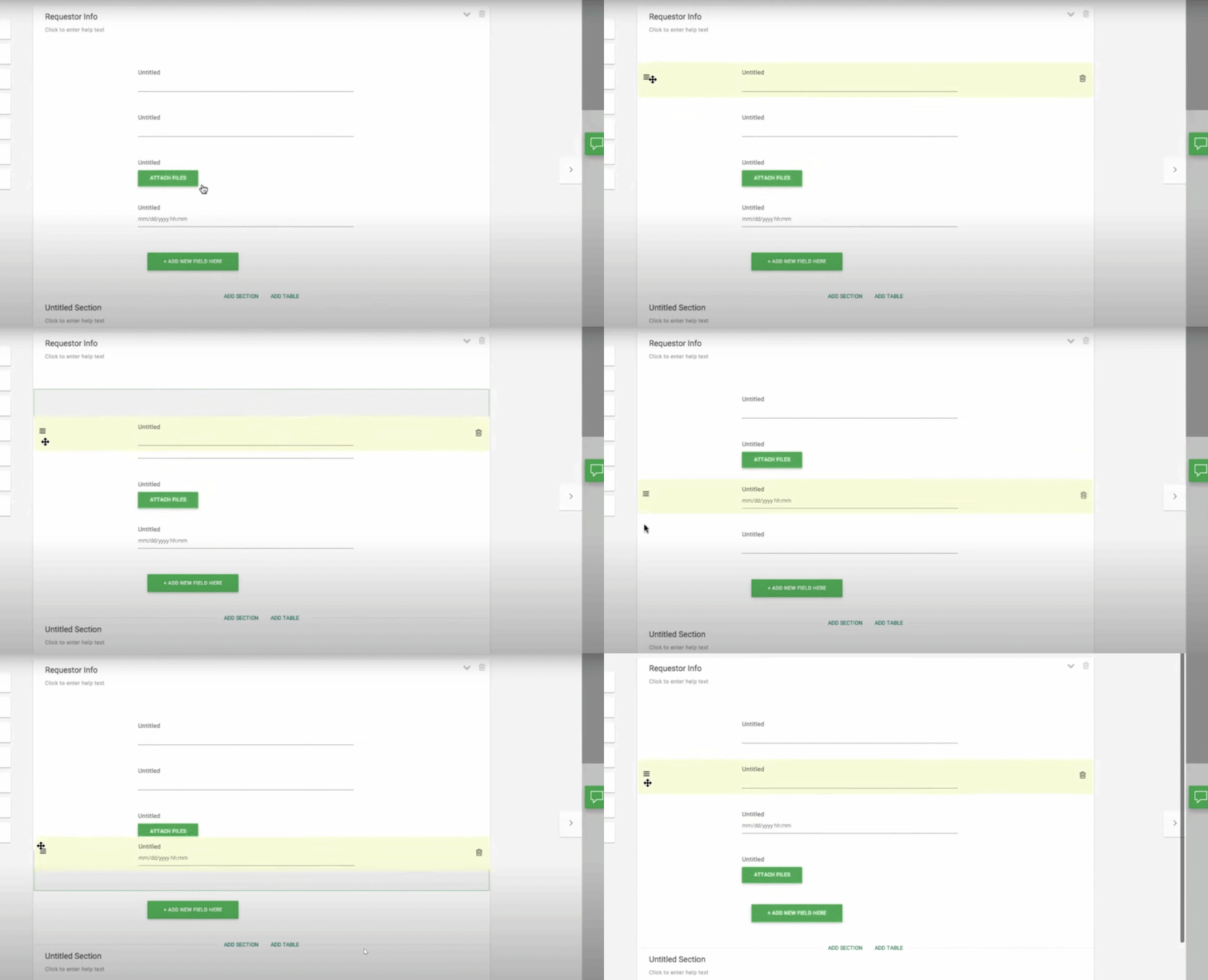
Move, don’t rebuild
Drag-and-drop reordering with familiar handles and feedback removed the “start over” penalty.
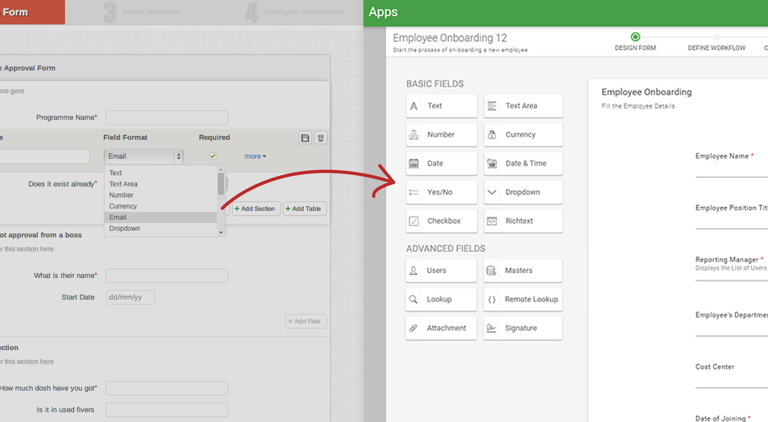
Visible field types
Basic and advanced fields (including rich text and signature) stayed visible as scannable tiles; after placement, creators could change field type without starting from scratch.
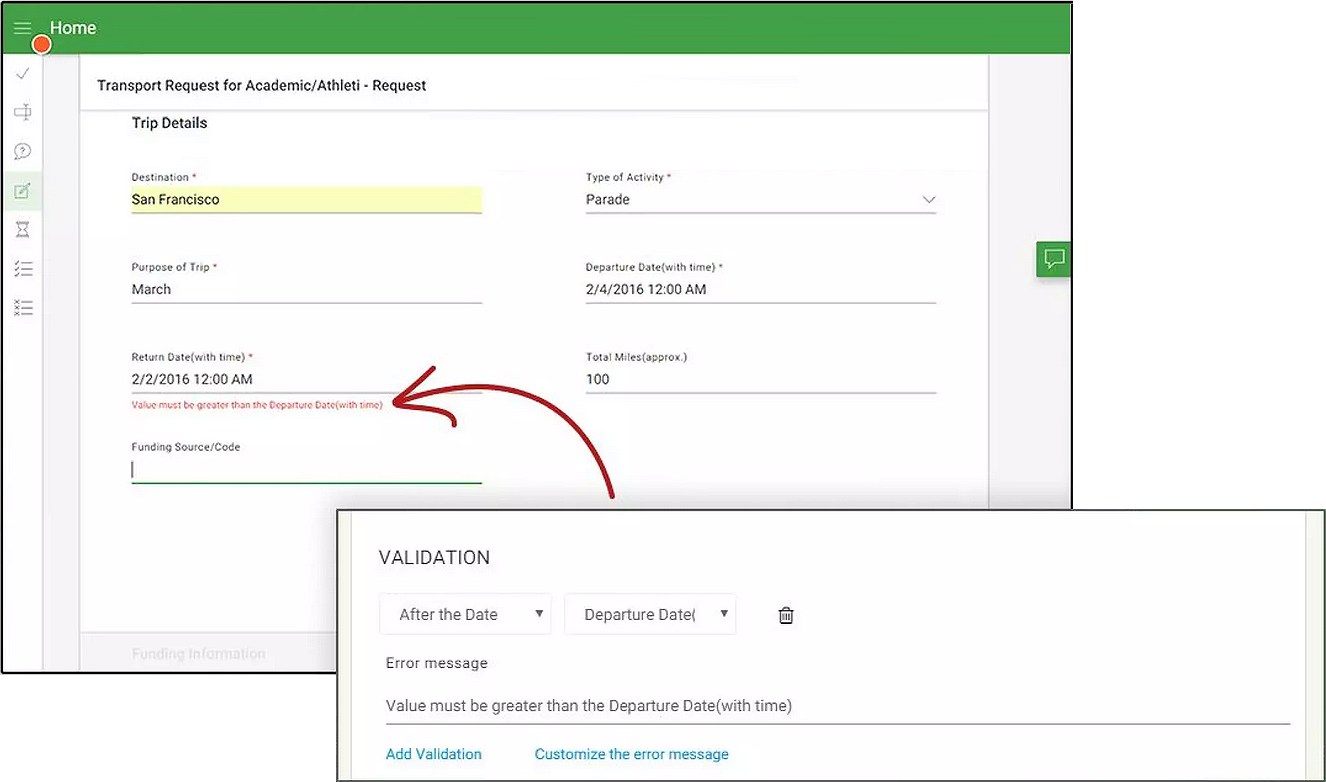
Creator-owned validation
Form authors define custom error messages tied to rules, so respondents see human explanations instead of system jargon.
Demos were met with enthusiasm. The form designer felt like a natural follow-up to the new dashboard and set the tone for broader product growth.
Results
Reducing Friction in a Core Workflow
The redesign focused on making form creation easier to understand, easier to edit, and faster to complete. After launch, we saw measurable improvements in both workflow efficiency and early product engagement.
20% decrease in average form creation time
The updated interaction model reduced unnecessary rework and made common actions easier to complete.
31% increase in new customer retention
A smoother form creation experience improved the usability of one of the product's core workflows, which likely contributed to stronger early engagement.
These results suggested that the redesign did more than improve the surface-level UI. It reduced friction in a critical setup flow and made the builder easier to adopt, especially for users encountering it early in their product experience.
More work
Continue exploring case studies